|
| Figure Outline Sketch- This was one of the first sketches I did this year, but I believe it turned out very well. I took photographs of friends, and then scaled them down and printed out a copy to trace through a light table. I think my line weights and consistency is good, the only thing I would change would be the facial features, I probably should have left them out. |
 |
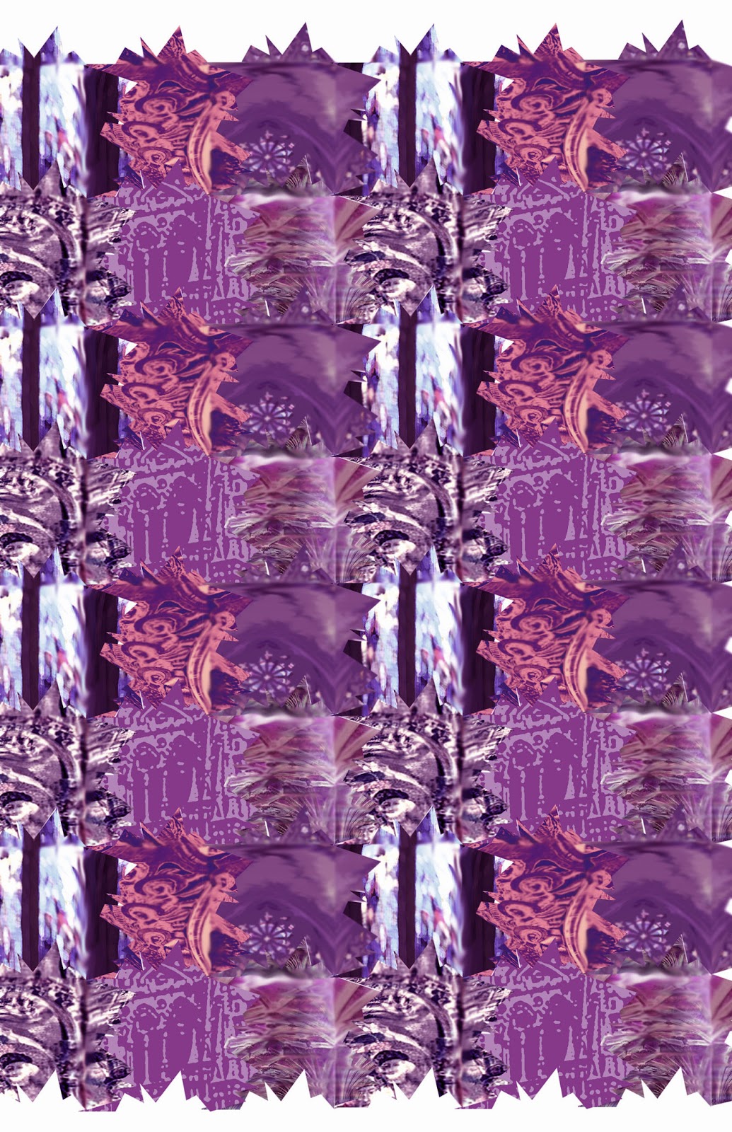
| Tessellation Sketch- With this sketch I chose objects in nature that presented tessellations, or patterns, for inspiration for my other tessellations done in Photoshop. I enjoyed learning about organic symmetry and patterns that exist naturally in nature, and then translating that into a digital design. |
 |
| Fruit Sketch- This was one of my favorite sketches, I enjoyed using the cross hatching technique to show depth and contrast with the fruit. I think it would be fun to play around with it and use different media, perhaps sketch pencils or markers instead of flair pens, as I think this one turned out so well I would like the explore other options. This was one of my most professional and realistic sketches. |
 |
| Negative Space Sketch- This was one of the more interesting sketches I did, as I have never created a space simply through the employment of contrast in the background to create a negative space. It was hard not to outline the chair first before sketching, but I resisted this to make the negative space more significant and successful. I would like to try this technique with other objects in the future. |
 |
| Chair Sketch- This sketch was actually more difficult to do than I imagined. Originally I planned on taking photos of each view of the chair, but I chose not to do this because I wanted to practice sketching things from life rather than through a photograph. These sketches parallel drafting that I have used in other areas, I see each view of the chair as a floor plan, elevation, and detail sketch. This was helpful with other aspects of my design career. |
 |
| Floor Plan Sketch- I thought that living in a space for a long period of time would lend itself to an easier task of sketching the floor plan, but it was actually very difficult for me to imagine. The proportions are a little off, but this quick sketch helped me see the space from the top, which helped with my drafting. The detail was equally as quick, but taking more time and doing it to scale would make it seem more realistic. |
 |
| Corner Sketch- This was yet another sketch I chose to do from life, I remember sitting in my dorm lounge and sketching this corner by the window. I like using sketch pencils, as it allows for layering of shades and contrast more so than pens do. I am satisfied with the level of contrast in the space, and the depth that is shown throughout. |
 |
| Doorknob Sketch- One of the last sketches I did, sketching on black paper was a fun task to take on. I enjoyed seeing how different colors created different levels of contrast on the black, and using different highlighting techniques allowed for a cool effect. Some of the colors I chose turned out differently than I thought they would, but the end result looks both realistic and unique. |
 |
| 2pt Perspective Room Sketch- I thoroughly enjoyed sketching this space, especially in two different ways. The first sketch shows the details of the space and the proportions within, whereas the second sketch shows the level of contrast as well as the lighting and shadows. Two point perspective has always been a little bit of a struggle for me, but I took my time with both of these sketches and I am very pleased with how they turned out. This taught me that if I choose to spend time on something that I am struggling with, the end product will be better. |