Friday, May 2, 2014

Comprehensive Depot Project

For this comprehensive project, my task was to finalize my Pacific Northern Railway depot transformation into an artist's gallery, residence, and studio space. As the depot has certain historical significance, adaptive reuse was a large component, as well as including universal design criteria in the residence, as one of the clients has a visual impairment. Spatial organization and concept application were also a focus, in order to have a cohesive design that is successful for our clients. I titled this project "Alternations", due to the geometric and linear qualities of my concept of the roof of the building.

Exterior of Building
One of the most enjoyable aspects of this project was being able to visit the site before beginning any of the preliminary work. This was very helpful in finding a concept that I enjoyed and could relate to, which was the roof and the architectural qualities associated with it. I was also very attracted to the historical relevance of the building and the story behind it, as this was at one point in time a working Pacific Northern Railway train station. This did influence my design process in the long run because I wanted to keep the original integrity of the building in tact. It would have been very difficult to spatially understand this building without first coming to view the whole space.


Parti design
Once I began the concept development portion of this project, I realized that I was initially attracted to the converging angles and variations in color that shadows create on the roof line. Depending on where a viewer is standing and looking at the building, they can see a completely different view than if they were at another point. This continued to be a theme throughout my development and has a direct correlation to my parti design. The varying thicknesses in angles symbolize the variation in the roof itself, and the geometric qualities are seen in the triangle shapes in the center. I also wanted to experiment with layering different lines and repeating them, to parallel this trend in the roof line if viewed from a distance. Later in my design I drew from the colors of the logo of the building, which are black and red. I very much enjoyed this aspect of the design process because it allowed me to express my own personal views of the project.

Textile design
After finalizing my design parti, I moved on into developing it into a larger 2D design pattern and textile. I enjoyed this for the same reasons as my parti, but it was more helpful to see how it correlates into a larger space. This is the main area where I applied the colors of the building, and translated my geometric patterns in a more literal way. In my design career I have never design a  textile before, so it was fun to go through that process and actually get a physical sample of my own design. Further in my residence space I applied parts of my textile into areas that I wanted to express my concept. Without this step in creating the textile it would have been difficult to visualize how it would look in an actual space.

Concept model
My personal favorite aspect of the entire process was translating these 2D designs into a 3D concept model. The main element I pulled from my parti was the triangle aspect, and I repeated this throughout the model in the form of cutouts. This was to show that just like the roof line, every angle of the model shows the viewer a different side depending on how they are viewing or holding it. I continued this application in my residence and gallery space as well, using cutouts with pops of color to tie into my conceptual design. One side of the model includes this pop of color, but can only be seen at the correct angle. The model also is not one sided, and can be flipped or rotated any way and is meant to be viewed in this manner. I loved being able to create this design and see it in a 3-dimensional way.

Process of building scaled model
The most challenging aspect for me personally was the creation of an accurate scaled model of the building. Creating concept models is very different than putting together a model with accurate dimensions, and this was much more time consuming. I greatly underestimated the amount of time it would take to complete this, as well as the math that was involved with the angles of the roof. It was a challenge picking out materials and adhesives to keep the model together, and constructing it was difficult and very easy to mess up. However, once it was complete it was very helpful to see the space as a whole, as there were aspects that were otherwise not included in my perspectives or elevations. The cutouts were one of these elements, and since they were so critical to my concept application, I am very satisfied with the site model as you can see these aspects. I feel much more confident with building models after going through this difficult process.

Overall, through this project I was able to work on aspects that I was less confident in, such as the model. I used to struggle with time management but the time constraints associated with this project prevented me from procrastinating things I otherwise would have. In terms of the final perspectives and elevations, I decided to use different media types to render them, which is something I never used to do. Presenting them in a final presentation allowed me to be much more confident in the way that they were executed. One of the biggest things I will take away from this will be the time management part overall. Working in a short amount of time with a great deal of work is extremely daunting, but doing this allowed me to produce work that I was proud of and in a quick amount of time. I will definitely be applying these principles to any design project that I will be working on in the future.

Wednesday, April 16, 2014

Sherwin-Williams Stir Competition


This poster represents a submission to a design competition, Sherwin-Williams "Stir", which involved creating a cohesive color palette using Sherwin-Williams colors and applying it in a unique way. The space directly relates to another project I was working on at the time involving a redesign of an Pacific Northwest railway depot, transforming it into an art gallery. The colors chosen reflect bright pops of vibrant color that would be seen in the art displayed, and are balanced out with the gray seen far right. Having never submitted to a design competition before, it was very helpful to go through the process and take this as an opportunity for others to see my designs. I have also never used such saturated and bright colors so predominantly in my work, and taking a risk helped further my ideas and explore different venues.

Friday, March 28, 2014

Gallery Visit

On a recent trip to Spokane, WA, I visited an art museum at the Gonzaga University campus called the Jundt Gallery. As I am currently working on a project that entails a commercial gallery space, it was very helpful for me to walk through this space and gain insight. I have always noticed in galleries that for the most part the walls are colored white, however in the Jundt the walls were clearly an off-white and closer to beige. This affected the individual pieces on display quite differently, there was less contrast between the walls and artwork, however it was much easier on the eyes for me as a viewer. Many of the displays were movable on an overhead track system, which is convenient to fit the needs of different exhibits. Benches and seating areas did exist in certain parts of the gallery, which is a convenience for people who wish to take a break from standing and viewing the art. Overall it was very helpful to take notes and observe all of these different aspects, and I hope in the future to be able to visit many more unique spaces.

Friday, March 7, 2014

Vision Impairment Exploration Exercise

As I am currently working on a project that involves a client with a visual impairment, I participated in an activity where I could simulate what a person with that condition can and cannot see. Myself and a partner wore sunglasses with petroleum jelly applied to the inside of the lenses, which greatly reduced our vision and made it difficult to decipher shapes, colors, light, and depth. Walking around in public spaces, I had to be guided by my partner to navigate even areas that I was relatively familiar with. Some places were much more easy to view than others, for instance, a library with a lot of natural light was far easier to see than the ground floor of a building with no windows. What I found most interesting was how some spaces seemed to accommodate more towards those with visual impairments, like ATMs that had braille and audio cues to aid with monetary transactions. Some spaces did not, however, and were extremely difficult to maneuver. This included areas with highly reflective surfaces like glass or metal. The biggest help, and something important that I will take away from this design-wise, will definitely be the use of color contrast and how much this aids in deciphering between different areas. Stairs are a good example of this, with colored strips applied as tread for better visibility between each step.

Monday, March 3, 2014

Concept Development

With this new project, my task was to remodel an old railway depot for the Pacific Northern Railway into a artist's residence, gallery, and studio. My specific inspiration for this was the angles of the roof line, as they are very unique and geometric in style and aesthetic quality. Using this knowledge and appearance, I explored the different angles and transferred them into design criteria such as sketches, abstract explorations, and 3D models.

Inspiration Photo
Looking at the roof in this particular photo, one can see the different geometric shapes used in the construction. Triangles, rectangles, and simple lines are all visible and unique. In the first stage of abstract exploration, I experimented with these shapes and the overlapping aspects of the roof line. Both thick and thin lines are used to parallel the contrast in the roof, as well as to show the layers and repetitive quality. Once I completed this part of development I converted my abstract design into a pattern on photoshop, adding color and rotating different pieces. The colors that I chose reflect the colors of the brick used on the roof, as well as the logo colors of the Northern Pacific Railway. Eventually once it looked the way I wanted it to, I sent it into a website that converts jpg images into textile designs (seen at bottom).

Abstract Exploration
Textile Design
The final stage of my concept development was using all of this knowledge and previous application and creating a 3D model. Conceptually speaking I continued with the usage of triangles, as I saw them as an integral yet simplistic element of the roof. In addition to this, I also used a pop of red to create a focal point, as well as the tie in the colors of my textile design. The model itself is made out of museum board, and I cut away parts of the triangles to once again highlight the various geometric aspects of the angles of this roof.

3D Model


Monday, February 10, 2014

Adaptive Reuse Case Study

The Flour Mill

In this exploration I researched with a group different locations and meanings of adaptive reuse. The specific site that I chose was the Flour Mill in Spokane, WA, which was an actual working flour mill at one time before it was transformed into a retail space. Working within a group for this was helpful because we were all researching very similar topics but different locations; collaborating helped me see different people's perspectives. In terms of the topic we researched, it was interesting to discover that many locations in America are part of the National Historic Registry to preserve their original integrity and character. Many locations are similar in this sense. The meaning of adaptive reuse is taking an existing space and changing some aspects of it, mostly aesthetically, while maintaining the original history of the space. The Flour Mill includes many structural aspects that were there at the initiation of the building, but the use of the space is now used for shopping and dining.

Monday, February 3, 2014

Habitat for Humanity Tiempo Commons

In this project, the Palouse Habitat for Humanity is in the beginning stages of its newest project in Moscow, Idaho. Working in a group environment with two other interior designers, we designed a space for the future inhabitants of this new home. With square footage limitations as well as a fairly modest budget, our work was pretty well cut out for us. Following Habitat's mantra of "simple, decent, and affordable", we planned a two story home with three bedrooms and two bathrooms with plenty of family space to encourage a sense of belonging and community. Our concept and inspiration of "roots" comes from both the literal aspect of the scenery of the Palouse, in addition to the conceptual aspect of the partner family planting their roots in a new environment. 
With no partner family selected yet, we decided to allow many different options for family dynamics in this house. The downstairs is built with aging in place in mind, with five foot turn-arounds in the kitchen and bathroom, and side by side washer dryers with pocket doors used as much as possible. Upstairs, there exists a family space/study area that can serve a multitude of functions depending on the residents. Having the space as small as it is was definitely a challenge for our group. However, it was very eye-opening to think so consciously about a volunteer project such as this; keeping in mind that volunteers are in fact the main source of labor. These limitations allowed us to recognize the amount of work and thought that goes into a Habitat for Humanity home, and I certainly hope to contribute to one in the future.
Graphic representation of living spaces and materials

Concept statement, floor plans, and exterior elevation

Sunday, December 8, 2013

Graphic Reflections


Reflecting back on my work over the last couple of months, this compilation shows my growth as a designer. There were many different types of media and graphic representations used and I represented my growth process across these three posters. My individual furniture renderings were applied further in the perspective rendering in a large scale application, which was difficult for me at first but became easier once I treated it one object at a time. In terms of digital media my compilation, on poster two, combined both hand sketches and layering images on Photoshop. Having done mostly hand sketches over the last couple months this aspect was easiest for me, but digitally this was a challenge. I applied the same concepts for the perspectives, focusing on smaller elements first and then the big picture. I hope to continue these skills in the future. 

Friday, October 25, 2013

Habitat for Humanity

Being able to work on a Habitat for Humanity project site was a great way for me to see how a house is built literally from the ground up. I had heard of Habitat for Humanity previously but was unfamiliar with how it actually operated and some of the tasks done by volunteers. The day that I volunteered was still fairly early in the project, I participated in nailing together load bearing walls, installing different forms of insulation materials, and transported part of the foundation. It was fairly strenuous work!

Hammering nails into exterior walls

One of the things I learned this day was how much work and man (or woman) power really went into building a house. Most of the tasks were fairly simple but were sometimes dangerous or required multiple hands. I was not aware until experiencing this that the future owner of the house puts in many hours working on their own home. It was great to be able to meet the woman who would be living in the house in just a few months. At the end of the day the benefits of this were two fold. On one hand, in a design perspective, it was good knowledge to discover where studs, nails, windows, etc., go in building a house from scratch, as well as what kinds of materials are used. In a more humanitarian viewpoint volunteering for this was such a fantastic opportunity to see how designers, architects, and various creators of the built environment can make an impact.
Myself and fellow designers after putting up an exterior wall

Saturday, October 5, 2013

Seattle Design Tour

zHome

Set in Issaquah, Washington, the zHome site is a series of condominium style living spaces that combined produce zero net energy. Asides from being aesthetically pleasing both inside and outside, the zHome is in the top tier of sustainable living. In a world where custom features and high priced luxuries may come to mind when one thinks of "beauty" in terms of design, many individuals and families are starting to make a shift into sustainable energy. Given that this site is a pretty extreme case of this, as every single aspect goes beyond even the Energy Star rating that many appliances and home features are given, it opened my eyes in thinking of this kind of client and aesthetic.

zHome Courtyard

What seem like many small choices actually add up to an extremely efficient and money saving unit. For instance, geothermal wells are drilled 200 feet down to allow for maximum heat and a saving of energy. There is no ground water runoff; tiered beds of rock allow rain water to flow down and be held in a basin until it evaporates back into the atmosphere. These are just a few examples, but there are so many that in some cases the homeowner could actually attain a surplus of energy and eventually receive a profit.


Westlake Residence

This construction site was a valuable experience within itself, simply because we got to see a residence in its unfinished stages. Though it was unfinished the stage that it was in allowed me to see some of the design elements that would be used. There were five stories total, each with a separate function:

Ground floor: Art Studio
1st floor: ADA accessible apartment
2nd/3rd floor: 2 story one-bedroom apartment
4th floor: Penthouse suite
Rooftop Patio


I found it interesting that each floor had a different client in mind; the two story apartments are quite small at only 600 square feet, whereas the penthouse took up an entire floor. Gorgeous, large scale glass windows surround the entire site, which allows for stunning views of the Seattle center and the Space Needle. Saving money in other aspects in the design process allowed for the owner to install these pieces of glass, for instance most of the wood finishes were from the owner's actual property instead of being imported. Working around the building codes for such a small space seemed to be the biggest priority and hindrance in this space, and that is definitely something I will keep in mind for the future.

Example of one of the loft apartments

Street Bean Espresso and Shelter

Touring the New Horizons teen shelter was definitely one of the highlights of my trip. Established in 1978 this shelter allows for young people ages 13-22 a safe place off the streets to get food, rest, and positive socialization. The Director is planning a remodel to allow for their offsite coffee shop, which gives sheltered teens stable jobs, a place in their current building. Currently there is social area, laundry, kitchen, dining room, computer access, restrooms, and various couches for relaxing. The design challenges in this space are pretty unique, the main one being that having many walls is undesired as this would prevent volunteers from watching the teens.

Common living area of New Horizons

However, the space itself is very open and requires little maintenance. Creative design is already implemented in some spaces; outside in the "transition space" (which is really more like a garage) chalk paint is used on the walls as a means to deter from spray painting graffiti. As this is not currently a "residence", in the future having dorm style living quarters may be built in the upstairs portion. Learning about how this space functions helped me see residential design through a different lens, as opposed to just single family living spaces.

St. Ignatius Chapel

This was one of my favorite locations. It was built fairly recently, in 1994, and the idea behind the design was of "7 bottles of light, bound by a stone box". Not very large and set against the urban design of the rest of Seattle, the church is a unique feature on the Seattle University campus. It is not a literal design, but the way that daylight fades in and out of the interiors through colored glass is an experience within itself. There is a play with both direct and reflected light, sometimes light would be a clear crisp color and sometimes it would seem softer, reflected on another surface with a different kind of light.

Sketch of alter

The designer chose to use fairly simple materials in the building of this church, concrete is used the most but zinc, bronze, and cedar are also used throughout the interior and exterior. They are used simply; the focus is directed on the reliance of light to show movement and texture in the wall treatments. I found so many different angles to sketch, each vignette was different than the next but all employed the same simplicity of design that made this church beautiful.

Frye Museum

In the entry space of this museum, the outside is employed as part of the experience. I loved seeing this. Water features are used along the entrance to bring a sense of calmness to the guests. A visitor begins by walking up a ramp, a universal design element that allows everyone to enter by the same means. At the top of the ramp, golden "gates" allow access to an interior dome space that opens up to the rest of the museum. Standing inside the dome, daylight shines through an oculus at the top, which plays a part in allowing the audience to connect to the outdoor elements. Daylight is used as a way of moving people through the space, which is true in many other designs. This is a nice way of controlling circulation within the space.

Once inside, there is little daylight but lighting still guides the way. The works of art are highlighted in light, so as to draw attention. The layout is very successful because of its simplicity, the walls are white and the floors are a solid hardwood. Nothing distracts from the art. High ceilings allow for the space to appear larger, and also for bigger pieces to be able to fit in such a space where there is not an excess of square footage.

Interior gallery space
Job Shadow

Being able to Job Shadow at CollinsWoerman, an architectural and design firm, was definitely the most insightful part of the trip. Though it was only for a day, it was helpful to see the inner workings of a professional environment. I personally shadowed one of the interior designers on staff, Amanda, and it was interesting to take part in the projects and various everyday tasks that occur as part of the job. CollinsWoerman is unique in the aspect that each member of staff occasionally does tasks in other departments, for example Amanda was working on a graphic design project on the side in addition to her interiors.

The way that the firm was set up was very open and called for interdisciplinary collaboration; architects were set up next to designers, for example, based on the assignments they were simultaneously working on. It was obvious in the work that they produced that this was beneficial to everyone involved, instead of being separated by department. I would love to work in an environment like this one day, where individuals are less of a job title and more of a working member of a successful team.

Sketch Crawl

            I loved being able to sketch around the Seattle Center, there are many interesting buildings, landscapes, and venues that are unique to this location. I chose to draw mostly buildings as opposed to landscapes solely of greenery or pathways, as I prefer the architectural and linear elements that a building has. I tried to stay away from drawing the Space Needle or the museum of rock and roll, because I wanted to try something different and less topical. There were so many beautiful vignettes to choose from it was difficult to just pick a few. I do however love drawing scenery, and I'm fairly skilled with shading and cross hatching. Some of my sketches I kept as contours, to bring the focus to the lineage of the building, and also because I wanted to sketch as many subjects as I had the time for. I tried to focus on perspectives in these drawings but I think my focus should have been in employing color. I noticed colleagues of mine managed to layer colored pencils and markers; usually I stick to just one media. I think it would be beneficial for me in the future to try this technique. 


Monday, September 23, 2013

Being Accessible

To explore the accessibility of some of my surroundings, I spent a half an hour in a wheelchair doing various everyday tasks. Some of these tasks were a little easier than others; even going between two buildings is not as easy as it seems. One of the main things that I noticed is that many of the doorways were not ADA standard, if the wheelchair would have been a little bigger it probably would not have fit through. The biggest aspect I noticed was that many ramps are not the one inch high for every one foot long standard, some are extremely steep and very difficult to maneuver. Elevators also proved tight with little turning radius, though some elevators were far more accessible than others.
Example of ramp
Another simple task that I had troubles with was entering and exiting certain restrooms. Those without automated doors I had to reach out to grab the door handle, then try to push myself through. I have pretty decent upper body strength but a person without this would not be able to enter this space at all. Some stalls were even more difficult, with the same issue, it was very cramped. Most sinks were accessible and within reason, almost all of the public restrooms I encountered were pedestal style so it allowed for leg room to roll under. For the most part, however, not many things were 100% ADA accessible, and it was cumbersome to try to maneuver through these spaces.
Cramped entry into stall

Monday, August 26, 2013

A Personal Sense of Home

To me, the word "home" evokes a sense of comfort, nostalgia, and security. In the ideal sense of the word, home is someplace to go to gain reassurance and feel emotionally at ease. A home is different than just a house; home has abstract memories and feelings that cannot easily be described. I grew up in Henderson, Nevada, and when I think of home the first thing that comes to my mind is warmth. Nevada is very dry and hot, which is different than Pullman or my current place of residence in Spokane, Washington. Heat changes the scenery, the feel, and look of a place. People interact differently in heat, a lot of time is spent at lakes and parks. The colors are different, they are more warm and inviting due to the desert atmosphere.

In this abstract representation of home, I focused on the natural aspects. As a child everything seems a lot bigger in proportion, hence the big cacti as the focal point. The sun stands out in the west, as I lived in the desert southwest. The flowers in the bottom corner represent a type of flower called Lantanas that my mother grew in the front and back yards. I never knew how she did it because not much grows in the desert but she managed to grow them all year long. My house is obviously the most realistic representation, and when I think of my house I think of big windows letting all the light into my front living room. In my mind my home was split into two places, the majority of my time was spent in the warmth Henderson, but the other part of my memories are where my aunt lives in McCall, Idaho. 

McCall is pretty centrally located in Idaho, and it holds a completely different set of memories for me than Henderson does. McCall is tucked away in the mountains, and specifically where my aunt lives little streams and tributaries criss-cross over farmlands and fresh alfalfa fields. Where heat is the adjective I think of with Henderson, smell is the word I think of most in reference to my aunt's house. She owns horses and some of my favorite memories from childhood involve feeding the horses or playing in the wheat fields surrounding their barn. Walking into the feeding shed it always smelled like alfalfa, which is one of my favorite smells in the world.

This is one of my favorite childhood photos, outside the wheat fields in the grass after I had been playing outside for a while. I loved that feeling of freedom I got when running around the fields with wheat almost as tall as I was.

Thursday, April 25, 2013

Sketches

Figure Outline Sketch- This was one of the first sketches I did this year, but I believe it turned out very well. I took photographs of friends, and then scaled them down and printed out a copy to trace through a light table. I think my line weights and consistency is good, the only thing I would change would be the facial features, I probably should have left them out.
Tessellation Sketch- With this sketch I chose objects in nature that presented tessellations, or patterns, for inspiration for my other tessellations done in Photoshop. I enjoyed learning about organic symmetry and patterns that exist naturally in nature, and then translating that into a digital design.
Fruit Sketch- This was one of my favorite sketches, I enjoyed using the cross hatching technique to show depth and contrast with the fruit. I think it would be fun to play around with it and use different media, perhaps sketch pencils or markers instead of flair pens, as I think this one turned out so well I would like the explore other options. This was one of my most professional and realistic sketches.

Negative Space Sketch- This was one of the more interesting sketches I did, as I have never created a space simply through the employment of contrast in the background to create a negative space. It was hard not to outline the chair first before sketching, but I resisted this to make the negative space more significant and successful. I would like to try this technique with other objects in the future.

Chair Sketch- This sketch was actually more difficult to do than I imagined. Originally I planned on taking photos of each view of the chair, but I chose not to do this because I wanted to practice sketching things from life rather than through a photograph. These sketches parallel drafting that I have used in other areas, I see each view of the chair as a floor plan, elevation, and detail sketch. This was helpful with other aspects of my design career.

Floor Plan Sketch- I thought that living in a space for a long period of time would lend itself to an easier task of sketching the floor plan, but it was actually very difficult for me to imagine. The proportions are a little off, but this quick sketch helped me see the space from the top, which helped with my drafting. The detail was equally as quick, but taking more time and doing it to scale would make it seem more realistic.

Corner Sketch- This was yet another sketch I chose to do from life, I remember sitting in my dorm lounge and sketching this corner by the window. I like using sketch pencils, as it allows for layering of shades and contrast more so than pens do. I am satisfied with the level of contrast in the space, and the depth that is shown throughout.
Doorknob Sketch- One of the last sketches I did, sketching on black paper was a fun task to take on. I enjoyed seeing how different colors created different levels of contrast on the black, and using different highlighting techniques allowed for a cool effect. Some of the colors I chose turned out differently than I thought they would, but the end result looks both realistic and unique.
2pt Perspective Room Sketch- I thoroughly enjoyed sketching this space, especially in two different ways. The first sketch shows the details of the space and the proportions within, whereas the second sketch shows the level of contrast as well as the lighting and shadows. Two point perspective has always been a little bit of a struggle for me, but I took my time with both of these sketches and I am very pleased with how they turned out. This taught me that if I choose to spend time on something that I am struggling with, the end product will be better.

Thursday, February 21, 2013

Tesselation Pattern


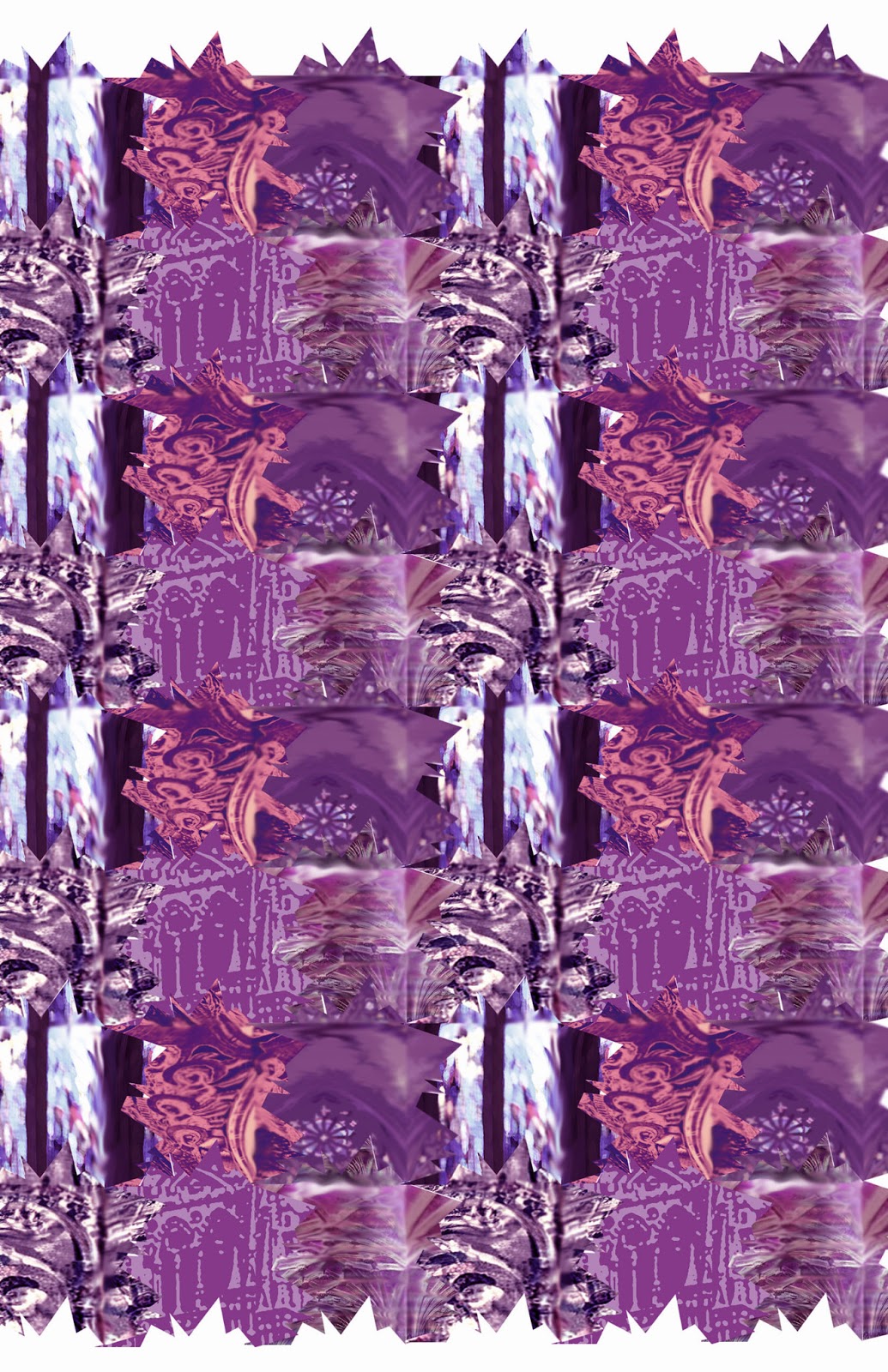
With this tessellation I began with a specific time period, the Gothic period, and created an artistic representation of my chosen era. I originally found images in books and online that appealed to me and reflected the mood that I was going for. After choosing around six or seven images I distorted them in Photoshop until they were almost unrecognizable, as this would make my final pattern more abstract. After much editing and choosing an appropriate color theory, which was analogous, I transferred my design to Indesign and finalized my tessellation. This I worked on for quite a few hours, with much frustration at some points. I enjoy my final project and there is not much I would change. Perhaps I would have distorted the images even more in order for the tessellation to flow better, but other than that I am very happy with my work.

Palouse Sketch

When I began this sketch I was not entirely confident in my abilities with Adobe Illustrator, but working with the digital sketch tablets was much more natural than I originally thought. I experimented with different brushes, patterns, colors, and textures to create an image of the Palouse. Beneath the layer that I was drawing on was the original image, making it easier for me to see where I did and did not draw. I varied my brush strokes in order to add depth and dimension to my sketch, and I am pleased with the result. I believe if I would have expanded on this even more I would have been more happy with my result. However, as a beginner with Illustrator I am satisfied with my sketch and confident that I can continue discovering better techniques.